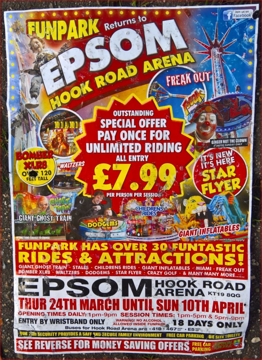
The style of both the flyer and the matching posters struck me as being peculiarly funfair and circus; I can't think of any other people who do posters in quite these startling tones of red, blue & yellow and all I can come up with today is Lichtenstein and Spiderman. Boxing and wrestling posters used to be quite gaudy but not, I think, in quite in this way - not that one comes across them that often these days.
The management decision was that the telephone would do a better job than the HP scanner, this last coming more or less free with the PC and having been excellent value, but it does not capture strong colour very well. The downside was that despite some effort, I could not get the image decently oblong, hence the triangular edges.
Reference 1: http://psmv3.blogspot.co.uk/2016/03/the-skys-limit.html.
Reference 2: http://psmv2.blogspot.co.uk/2013/04/lichtenstein-take-2.html.
Reference 3: http://www.johndavisfunfairs.co.uk/funpark.html. Respectable enough to run to a web site! I couldn't find it on the flyer, but google, as ever, obliges. There is presumably some relationship between this John Davis and the Billy Davis who runs what looks like a very similar operation.
No comments:
Post a Comment