Contents
- Introduction
- An aside on colour and texture
- Regular objects
- Complex objects
- Perverse objects
- Intensity and coherence
- Adding up vision layers
- Scenario 1 – out of the welter and waste and darkness
- Scenario 2 – object A moving behind object B on the same layer
- Scenario 3 – object A moving behind object B on different layers
- Scenario 4 – transparent objects
- Scenario 5 – a complex object (a wooden table)
- Wire diagrams – the wrong path
- Other points
- Correction, conclusions, abbreviations, new terms and references
31 figures. Clicking on any one of them will enlarge that one and bring up a menu of the others.
Introduction
Following the post on binding at reference 1, we now look in more detail at occlusion, on the way that we propose dealing with it and on some of the issues arising from having vision data on more than one layer. And some matters arising.
Bearing in mind that the detail is going to vary from person to person and from time to time. For example, one person may have more interest in the hidden parts of objects than another person. And any one person’s interest is going to vary with time and place. Then some people will have a better developed sense of the three dimensions of a real world object than others. There may be a sex bias here. There may also be an eyesight bias. That is to say, LWS is built on vision and the LWS of people with poor eyesight may be the poorer for it.
In what follows we have at least sometimes used the terms ‘scene’ and ‘part’ in their ordinary senses, rather than in the special senses which we have defined elsewhere and summarised in Figure 31 below. We hope that this does not confuse.
Once again, this paper has been written with little knowledge of how engineering and technical drawing packages do such things, although we have drawn from examples from them. Not to mention all the work being done on robot and other kinds of machine vision. More knowledge may well have put a different slant on what follows.
An aside on colour and texture
We are not here concerned with the detail of the texture of the parts of layer objects, this texture being what carries the details of sights, sounds, smells and so on.
But we note that, at this stage, there are various possibilities for colour. It is possible that colour will be coded by clusters of cells. It is also possible the colour is in some sense basic, with the value of a cell coding for colour in some direct way, so one for red, two for green and so on, maybe half a dozen or more altogether, but remembering here that high and low value are already spoken for. Colour would then be expressed as an additive mixture of coloured dots, in much the same way that it is in a roadside advertisement – and it being for further consideration whether vacancy, low value, was experienced as black or white – or maybe, even, a nondescript grey. Something less positive than black or white. In any event, given the large number of cells, considerable resolution would be possible.
While more complicated coding schemes would be deployed for the other senses.
In the figures that follow we use colour, but not to show colour in the ordinary sense of the word, rather just to distinguish one part or object from another, to help with the diagrams.
- Blue for high value cells
- Yellow for low value cells
- Green for background parts
- Pink for foreground parts
- Red for the surrounds for layers
- Black for the surrounds for vertical sections.
To conclude, we also note that we have no idea what one of our layers would look like through a microscope. But while it is possible that one would see recognisable stuff, it seems unlikely that one would see much colour.
Regular objects
At reference 1 we looked at how a visual representation of a world consisting of more or less convex solids, solids with shape and substance like children’s building bricks, could be built in a layer of our LWS. A world to which we added a background and a foreground.
One of these bricks was represented as a layer object, usually broken down into parts, with the parts often corresponding to the planes or faces making up the surface of the brick. In the case of a cubic brick, one usually represented just two or three out of the total of six faces in this way. Note that it was not necessary to break multi-coloured faces into several parts as the appearance, the texture could vary across the one part. By extension, one dealt with other, more or less convex, solids in the same way.
Now while the layer included information about the order of objects, front to back from the point of view of the host of the LWS, who or whatever it was that was having the subjective experience, it did not include information about how far away ordered objects were, one from another. It did not distinguish the scenario where the front brick touched the one behind from the one where the front brick was miles in front of the one behind. Or that where a brick stood on the foreground from that where a brick was flying through the background.
To deal with this, we have proposed using composite objects on a second layer and column objects, with the combination admitting fuller description of the relations between layer objects.
Complex objects
But by no means all objects, for the purposes of LWS, for the purposes of consciousness, can be considered to be more or less convex solids triangulated, described by a collection of opaque, non-reflective surfaces. Children, for example, start to learn about objects like boxes which have and inside and an outside from quite an early age, say a year or so. They probably start to learn about transparent objects like windows and glasses before that. One of my own early memories is about being fascinated by objects which one could look through, objects like the sleeve of a box of matches.
Perverse objects
There are objects which are more complicated still, which are not going to fit our LWS world terribly well. Think, for example of something like a Möbius strip or the scenes concocted by Escher, scenes which have a logic of sorts but which are apt to confuse.
Our argument here is that the brain’s machinery did not evolve to deal with objects of this sort, rare in our ancestral jungles and savannahs, and it should come as no surprise that the brain should be confused or tricked by them.
Intensity and coherence
The visual signal from a layer has two important properties. The first is intensity and the second is coherence, with the second but not the first of these also being a property of an individual layer object.
Intensity is the power with which a layer is being activated, with zero intensity meaning that the layer has been, in effect, turned off, although the information is still there. While coherence is about the geometry of the layer. The two properties are more or less independent of each other. Note that a layer with zero intensity is just not there, while a layer with zero coherence is white noise, more or less loud according to intensity.
Intensity is illustrated in the two figures below using the Powerpoint transparency feature. In the first we have 100% left and 50% right. In the second we have 66% left and 33% right, giving us four levels of intensity of the same underlying scene.
 |
| Figure 1 |
 |
| Figure 2 |
 |
| Figure 3 |
If we present two lots of visual information to consciousness, we will usually make one significantly weaker than the other, either in terms of intensity or in terms of coherence, so giving us, as it were, a primary and a secondary image, which is fine. While two signals of more or less equal strength are likely to confuse.
Adding up vision layers
Work so far suggests that it is going to be helpful for the LWS to hold information about what things look like on more than one layer. So how does the information from several layers get combined into a unified experience? Part of the answer is that the information is not combined, is not added up. Nor, even, does it amount to a unified experience, except in so far as the experience, such as it is, is all happening at the same time. Rather, the information from the various layers co-exists. And to the extent that the information from one layer does not fit with that from another, the experience will be incoherent – and at the limit may be little better than noise.
We may not need any one layer to be restricted to one modality, although restricting a composite object to one modality seems a likely minimum requirement. However, what we address here is combining information about what things look like from more than one layer.
Now our LWS works a bit like radio, with each of its layers being assigned a frequency band. The signal from any one layer is that part of the overall neural activity in the frequency band in question, with the signal at any one frame being the variation of amplitude of that activity across the array of cells of the layer, noting that within a frame, an interval or the order of a second or so, the variation is in space, not in time. Such signals clearly can be added up; adding up the components from the various frequencies is a natural thing to do. It is what the physics, what the brain does.
Which means that the compiler has to sort all this out, to decide what exactly it is that is to be added, before it presents the LWS package to consciousness.
The key issue seems to be that visual objects do not combine, do not add up in the way that, say, audio objects add up. We can add audio signals together and while they can, in theory, cancel each other out, in practise they often co-exist. Furthermore, the combined signal can often be broken back down into its components. The same is probably true of smells and tastes. While visual signals do not combine in this happy way and, generally speaking, a front object will block out a signal about a back object; the front object occludes the back object. With the upside being that at least we are clear about the front object. On the other hand, while the signal in question will most often or mostly be derived from signal arriving at the retina, in real time from real objects, which in this case would not include signal from the occluded back object, it may also include brain derived signal, which opens up the possibility of getting signal about such an object, even in the case where the front object is not transparent.
We now move onto some examples.
Scenario 1- out of the welter and waste and darkness
Being the words used by Robert Alter in his translation of Genesis, first used here at reference 4. In the figures that follow we illustrate in simple terms how this might happen in our world of LWS, either in the long time of evolution or the short time of growth. Or perhaps both; in the well-worn phrase from biology, perhaps ontology recapitulates phylogeny. Or in the even shorter time of waking up in the morning.
 |
| Figure 4 |
 |
| Figure 5 |
 |
| Figure 6 |
 |
| Figure 7 |
 |
| Figure 8 |
 |
| Figure 9 |
And it may well be that we leave the old image in place on the old layer. The new image which has been tidied up a bit, in the way of a diagram, can sit, more or less directly, on top of the old image, and having both active at the same time is not usually going to cause visual confusion. Alternatively, the compiler might replace the old image with low values, probably tidying up surrounding objects a little, while it is at it.
We call this process elaboration. We can also put this process into reverse, backing back into the welter and waste and darkness, this being the dilution introduced in the next section.
Scenario 2 – object A moving behind object B on the same layer
 |
| Figure 10 |
 |
| Figure 11 |
Option one, intensity. The compiler might deploy intensity as a volume control on layers, a number which we have called intensity, but which might also have been called activation or visibility. The activation processes associated with a high intensity layer are stronger and result in a higher intensity subjective experience. Furthermore, things might be so arranged that when a given quantum of activation flows from one layer to another through a column object, it will have more effect in when it arrives at a high intensity layer than when it arrives at a low intensity layer. So, while we might talk of flow, we might have something more complicated in mind than a hydraulic theory of activation. There might be something else going on.
Option two, coherence. An alternative, or perhaps complementary, wheeze would be to thin out the material on what we are calling low intensity layers. Boundaries which are ordinarily thick (wide gauge) could be made thin (narrow gauge), textures could be thinned out by increasing the density of low value cells and the structure of parts could be thinned out. We call this process dilution. One might store the start and end points of dilution on separate layers, wanting to have both versions of the story to hand.
Note again that hitherto we have shown most boundaries as being one cell thick, convenient when we are illustrating what goes on in arrays which are a thousand or more rows by a thousand or more columns in arrays which are perhaps fifty by fifty. In the real world of the LWS, boundaries will be of varying thicknesses.
One way or another, the overall effect is that the small blue, occluded rectangle on the right of Figure 10 above is experienced rather weakly, somewhere in the background of the scene on the left.
 |
| Figure 12 |
At the top we have a simple linkage of the visible part of the blue object connected by a column object to the whole of the object on some other layer. While at the bottom we have interposed a descriptive object, a composite object with purple payload, linking the visible to the invisible part, appropriate to a rather stronger sense of the presence and nature of the invisible part. Note that the measurements of the link objects (in this case on layer 358) do not need to equate to those standing for the real world objects.
In terms of intensity, at the top we have high intensity row 335 and low intensity row 339, while at the bottom we have high intensity row 354 and low intensity row 362. Row 358 is not visual and comes into consciousness in a different way because apart from being a transmission belt for activation, its content is more verbal than pictorial.
 |
| Figure 13 |
Scenario 3 – object A moving behind object B on different layers
We suppose that much of the time it suffices to carry most of the visual component of the scene in front of us on a single layer. But sometimes it will be convenient to separate out some objects onto their own layers. Perhaps, for some reason or another, one has just separated out the object of attention in this way. Or perhaps it is convenient to hold onto a layer object which represents the whole of the partially occluded object, not just the bit that can be seen. A layer object which supports prediction of what happens when there is movement of one or other of the objects.
 |
| Figure 14 |
A simple way to deal with this would be to say that the left-hand layer was high intensity and the right-hand one was low intensity. But this would not usually reflect what was going on in the real world, where little signal was arriving from the top left-hand corner of the blue object. The imaginative brain cannot usually match the intensity of a real signal.
 |
| Figure 15 |
 |
| Figure 16 |
In 2 and 3 the yellow bars remain part of the boundary, being connected to the dark blue. In 4 most of the yellow squares are isolated cells of the interior. While in 4 we have all the yellow in the interior, having been separated from the boundary by a strip of pale blue. Similarly, 6, 7 and 8.
It may well be, of course, that UCS can manage much the same thing without this pedantic attention to the rules.
We can qualify the relationship between the two objects, for example, the distance between the two objects, in much the same way as in scenario 1.
Scenario 4 – transparent objects
Here we move onto objects which are transparent. In the case that one object was simply and entirely behind a transparent object, with no parts peeping out at the sides, we might not chose to raise the first object at all, settling for rendering it as part of the second, transparent object. Or where there is peeping we might split the object behind into two separate layer objects, one behind and one peeping. Arrangements which might work in simply visual terms, but which do not help comprehension very much. We suggest that having two complete objects, one in front of the other is going to be more useful, at least some of the time. So how do we express the fact that the object in front is transparent?
 |
| Figure 17 |
 |
| Figure 18 |
Note first that the brown cells are all connected up and so still constitute a region in the sense of reference 5 and the yellow bars are just so many holes; no visual image or experience arising therefrom. And that, given that the number of rows and columns involved is usually quite large, we can vary the dilution with some degree of precision between just over 0% and exactly 100%.
And second, that we have damaged the experience of the structure of the top left-hand corner of the blue object. This may not matter to the extent that this will not affect the activation processes which work on layers, at which level the structures will be fully visible. The experience is damaged a bit – but then it would be. Not many objects are perfectly transparent.
 |
| Figure 19 |
Remembering also that in the LWS proper, there would be a lot more rows and columns and, relatively speaking, there would be a lot less clutter. The housekeeping stuff like boundaries and column objects would take up a lot less of the space available.
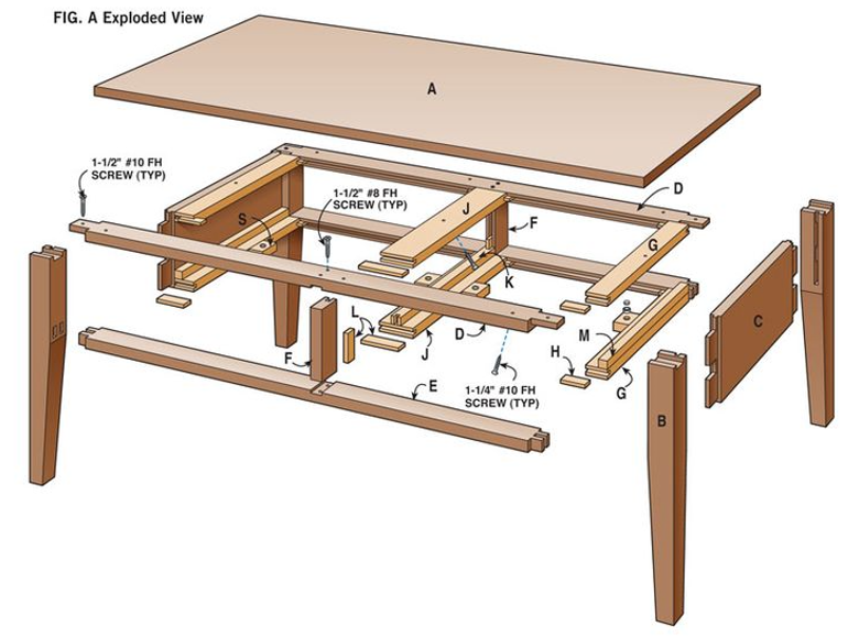
Scenario 5 – a complex object (a wooden table)
Here we look at more complex objects, objects of which we can only see some small part at any one time, with some of its bits always occluded by other bits, where we cannot see behind and we cannot see underneath, never mind inside. We also look at the support which may be given to vision by pictures and diagrams on paper and on screens, pictures and diagrams which can leap over all the petty constraints of the real world.
 |
| Figure 20 |
 |
| Figure 21 |
We might start with something like the figure which follows, echoing Figure 7 above.
 |
| Figure 22 |
Then, maybe we start to add a bit more structure, some layer objects, as shown in the figure which follows. In the frame that follows, picking up the jargon of Figure 31 below.
 |
| Figure 23 |
 |
| Figure 24 |
 |
| Figure 25 |
He can certainly produce a diagram of this sort with the help of paper & pencil or a computer, but that is not the same thing at all.
Furthermore, neither Figure 24 nor Figure 25 are real world images of tables, and it is quite hard to combine the two, to produce a comprehensible diagram which sticks within the bounds of the seen image. Figure 26 which follows suggests a decomposition into parts of a layer object representing the table of Figure 20, a decomposition with top, rails and legs and which adds value to the raw image, puts at least some structure and regularity on it. Relates it to other similar bits of furniture which one has come across in the past. But in terms of information content, it is well short of Figure 25.
 |
| Figure 26 |
A housewife might think of spiders hiding under the table top, but they can be dealt with in the same way as the forth leg.
So, in sum, we get more that Figure 20 but a lot less than Figure 25. A start, which we can probe further should our interest be aroused. Subsequent frames of the scene might bring out the results of such probing.
Wire diagrams – the wrong path
We wondered about the sort of image that one gets by just showing the edges of the polygons into which a real world object has been broken down into, maybe triangulated into. Polygons which map all the surfaces, perhaps inside as well as outside. An advantage of such an image would be that all the hidden parts of the object, the parts which are occluded from any particular point of view, would now be visible.
This works reasonably well in the case of a simple object like a cube, an object which looked OK anyway and does not really needs this sort of treatment. The dotted line convention makes back clear from front; there is no doubt that we are looking at a cube. Although visibility of faces and edges has been paid for by ambiguity about whether we are looking at a fish tank, a cardboard box or a child’s wooden building brick.
And we do need to remember that there is no such thing as a line in UCS or LWS. In the latter, the best we can do is rows of cells with varying gauges. Not so neat microscopically, although not so bad macroscopically. And better horizontally or vertically than otherwise – from where I associate to a memory of reading that the retina does best on vertical lines. Providing, I suppose, that one is not reared in a world consisting of horizontal lines.
 |
| Figure 27 |
 |
| Figure 28 |
 |
| Figure 29 |
Other points
Tastes and smells can be mixed in a way that vision cannot, although it seems likely that some tastes will blot out other tastes and some smells might blot out other smells.
The same sort of thing is true of sounds, although with speech there is plenty of redundancy and it is quite often possible to separate out the speech line that is of interest. One can pick out the signal in which one is interested among quite a lot of clutter. Otherwise known as the cocktail party effect, whereby you know that someone is talking about you, someone whom you can see, some yards away, but whom you cannot really hear. See reference 2.
Music lovers sometimes claim that they can hear, on a more or less continuous basis, all four lines of a string quartet, somehow hear both the parts and the whole. This presumably works because here again there is plenty of redundancy. But I suspect things would get much harder if one had four first violins playing the first violin line from four different quartets: that might just be noise, a sort of loud version of the buzz of talk you mostly hear at the cocktail party.
 |
| Figure 30 |
Another sort of compromise is Powerpoint with its transparency or films with their alpha channels, mentioned at reference 3. Human vision can manage transparency with things which are transparent and can fake it a bit otherwise, but cannot really impose it on things which are not, in the way that Powerpoint can.
Computers more generally can do something in the way of three dimensional vision, perhaps no more than three dimensional wire diagrams, but even then it is sometimes quite difficult to keep that something visually comprehensible, as is shown in Figure 28 above.
Sometimes, when one is tired, one has double vision, which usually manifests itself in the foreground object being attended to being doubled up, say with one copy of, for example, a figure on the television, being next to another. One is unware of any such doubling up in the background, possibly because one is not attending to it. From the present point of view, a fault in that part of the system which combines the images from the two eyes together. No difficulty about projecting two copies of the same image to the LWS.
Correction
We have moved on a little from the soft box model of reference 3. The current view is more like that which follows, made simpler with the loss of soft centred patterns and elements and made more complicated by the addition of UCS objects, column objects, composite objects and extended objects. At any one frame, the subject of attention is the layer object which we are attending to. Any one UCS object will be represented by zero, one or more layer objects.
 |
| Figure 31 |
We have looked at occlusion, the business of, from some particular point of view, one object being more or less in front of another object. A corollary of our working in our two and a bit dimensional world, of our down-sizing the real world. We have also looked at what we might mean by adding up layers to give a unitary experience. We have sketched what LWS might do.
The story seems to be that while most of what we experience as vision will be held on a single layer, there is room for some of the data, including here both vision, words and other supporting material, to be held on other layers.
New features are the reciprocal processes of elaboration and dilution. We start with a fairly blank sheet and put structure and content onto it. We create layer objects – with parts, textures and boundaries - and column objects. In other words, we paint a picture – not the same thing as a photograph at all. We call this process elaboration and it is what we do when we start to pay attention to something. Then there is the reverse process of dilution when we back out and our painting gradually sinks back into the void.
LWS remains a workable, a viable proposition, but we have strayed into areas where there is too much choice. Too much choice about how to address particular, practical problems. We need more work and probably some experimental data in order to narrow down that choice, experimental data which is going to be hard to get. An analogy might be a product like MS Office. You have a huge toolkit and there are usually various ways in which one can address any particular problem – but it takes experience to know whether it matters which way to take, and if it does, which is the best way to take.
Abbreviations and new terms
LWS – the local workspace. The proposed vehicle for consciousness. Named for contrast with the GWS – the global workspace – of Baars and his colleagues. But which might just as well be called the layered workspace, given the importance of layers therein.
UCS – the unconscious, the brain at large. Where all the heavy lifting is done which makes LWS possible.
Coherence – the amount of signal, as opposed to noise, from a layer or a layer object. Coherent objects will have strong, clear boundaries and regular, repetitive textures. Coherence is about what is happening on the data layers, the low frequency layers of LWS.
Dilution – the business of progressively weakening a more or less highly structured layer object. Thinning down its boundary, thinning out the texture of its interior. Thinning out the structure. At the limit, merging the layer object back into the background. Moving from coherence to incoherence.
Elaboration – the business of taking raw image, more or less what one might get from a digital camera, and, progressively, putting structure on that image, making it conscious and comprehensible. Moving from incoherence to coherence.
Gauge – the breath of the high and low value lines of cells making up boundaries. In the illustrations here, mostly one or two, but in real life rather more.
Intensity – the degree of activation or visibility of a layer. An intense layer will be strongly felt or experienced. Intensity is about what is happening on the (activation) process layers, the high frequency layers of LWS.
References
Reference 1: http://psmv3.blogspot.co.uk/2017/07/binding.html.
Reference 2: https://en.wikipedia.org/wiki/Cocktail_party_effect.
Reference 3: http://psmv3.blogspot.co.uk/2017/05/recap-on-our-data-structure.html.
Reference 4: http://psmv3.blogspot.co.uk/2017/06/on-elements.html.
Reference 5: http://psmv3.blogspot.co.uk/2017/07/rules-episode-one.html.
Reference 6: https://cadsofttools.com/.
Group search key: src
No comments:
Post a Comment